
6 Ways to Create a Captivating Company Blog
December 17, 2015
Engineering
You have to think about the font, colors and images and that’s before you’ve even written any content. In a world with so little patience, you only have 5 seconds to impress, so you’d better make their experience stand out or they’ll leave and never come back.

Sure, people can adjust the font size, but do you want to? Do you want to adjust your car seat every time you get in? Expecting your users to zoom in every time puts them in a similar position.
Oliver Reichenstein, ia.net
While you want your company blog to look like it’s come off the set of the new Star Wars, you still need to be accessible to as many people as you can.
Clean, minimal and futuristic is great and all but if people have to fire up Readability to read the text you’ve done a bad job.
Don’t spend countless hours creating a brand new blog design when you could employ these 6 things that will improve your readers experience on your current design. They shouldn’t take too long and they’ll make a big impact.

Before we tuck into our 6 tips, let’s take a look at why you should bother making a company blog at all, and why you should prioritize creating value.
Why Create a Company Blog?
Since around 2011, content marketing has become a common (overused, maybe) buzzword. Many companies scrambled to make content for their company blog, but most did it wrong.
Good content was shunned in favor of boring content, filled with statistics to try and distract the readers from the poor writing. Infographics were soon introduced to distract readers even more, and now video is doing the same.
Some of the more successful companies, though, were bothering to write content. And they continued to do so to gain loyal readers and customers.
Here’s a Google trends chart to show how content marketing’s been on the rise since 2011.
And guess what? It’s set to carry on rising!
Some startups have thrived because they chose to invest their time in content marketing and have taken the time to plan it out. These startups have gone from nothing, and in just a few years have become household names for their industry.
It’s not all rainbows and unicorns though—there are many blogs that are unsuccessful because they are inaccessible to readers, lack direction, or are just super boring. Picking design over readability is something that has plagued blogs for years now.
A reliable blog can only be effective if intuitively navigable by its target audience.
Perrin et al, International Journal of Instructional Technology and Distance Learning
Lets take a look at the anatomy of a few great startup blogs and analyze how they leverage their content marketing. We’ll look into their font choices, images and how they captivate readers to draw them in.
1. Create captivating featured images
Spending time on your featured image can wow your audience. While many company blogs use a royalty-free stock for their featured image, taking the time to create custom photographs or illustrations can make a big difference.
The trouble with using photographs is that they’re stuck in reality. Unless you Photoshop something (like a Butterphant) it’s going to look pretty realistic.
Custom illustrations can spark imagination and draw the visitor into your blog post.
Take a look at HelpScout’s featured images.
While they could easily grab a photograph of a Formula 1 racing car off the internet, they decide to craft an illustration instead. The bright colors and fantastic design draws you into reading their content. I get excited for their posts every week.
The same goes for StatusPage’s blog.
Photos of people working would do just fine—but it’s not good enough for them. The team meticulously design featured images to match their content and again, draw in readers.
You may need to hire a designer for this, or you could use tools like Canva and do it yourself. If you’re looking to learn how to design similar images, check out IconUtopia.
Takeaway: Use bold colors and custom illustrations to capture your audience’s imagination and drive visitors to your blog posts.
2. Add a sidebar for quick links
If you’ve been blogging for years, you could make your readers dig through your archive for your best posts. There’s a better way though—a sidebar.
Sidebars can be useful and pretty. I know there are a ton of Wordpress sidebars that are hideous, but that doesn’t mean yours has to be too.
With a bit of CSS ♥︎ you can spruce up your sidebar.
Intercom have done a very good job on their blog at helping you find their best content on your very first visit.
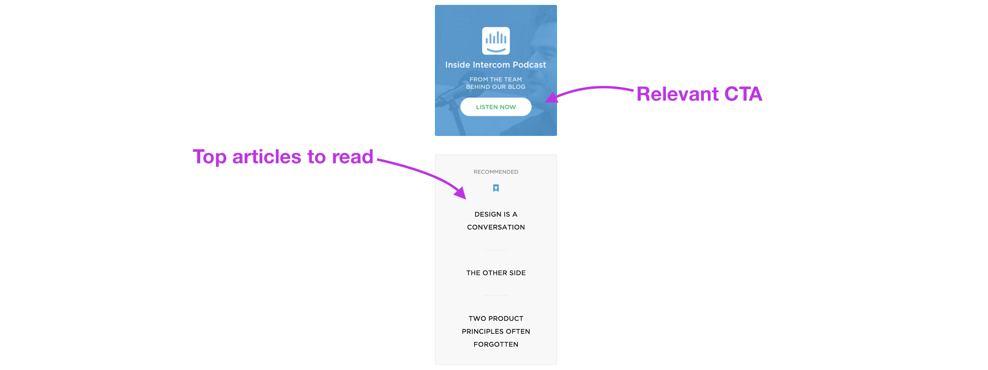
Not only does it benefit the readers, it also benefits the company. By recommending their top content they can drive traffic and hopefully customers.
In addition to the recommended section, they’ve created a call-to-action (CTA) to funnel readers to their podcast.
The Ghost Blog has another prime example of a sidebar that shows some love. Much like the Intercom sidebar, they show a strong CTA to convert visitors into loyal readers.
The CTA in this sidebar is to subscribe to their email updates so they can let you know about their latest posts.
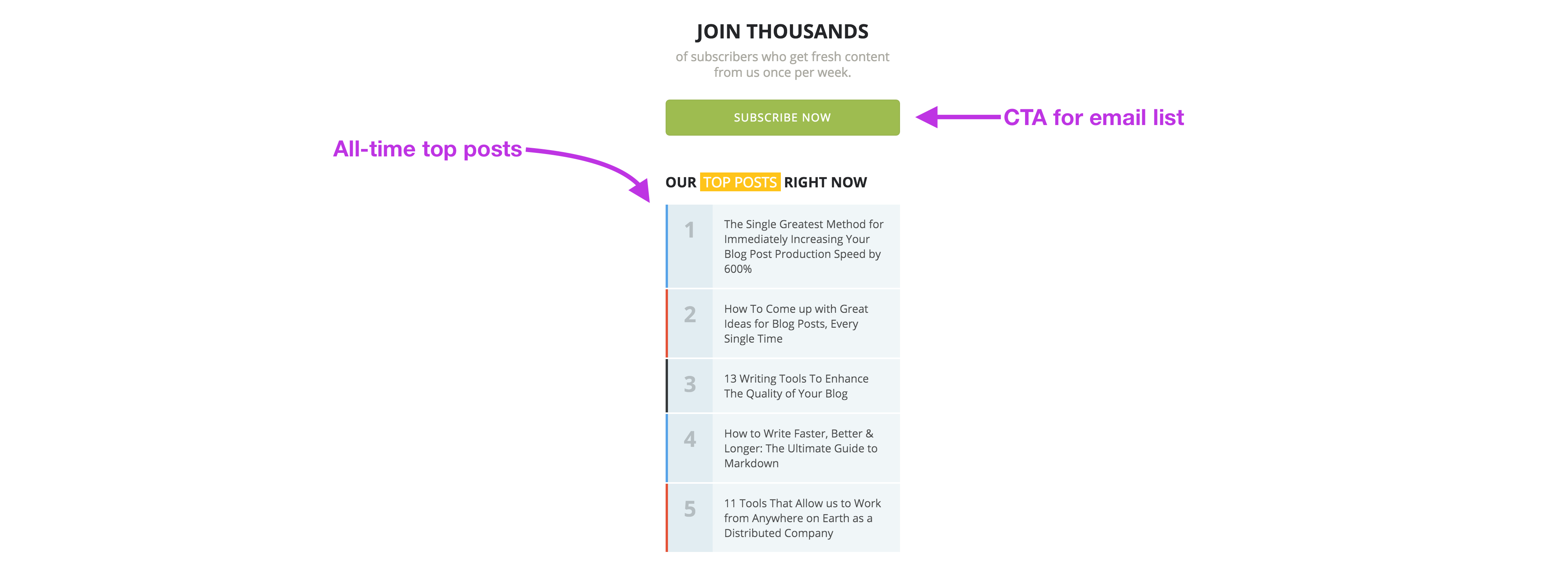
Below they also have top posts, however the Ghost sidebar shows all-time top posts, whereas Intercom’s were recommended by the authors.
It’s up to you whether you recommend your favorite posts or your all-time top posts, but you may find that the Ghost version drives more traffic and decreases bounce rate.
Takeaway: Add a sidebar to help visitors find extra content or the most popular articles. You can also add a CTA to drive leads to your homepage or extra content.
3. Make it easy to navigate
Once visitors land on your blog, they need to be able to find interesting content easily. Don’t make your readers scroll forever to find the content they’re after.
Use an archive or categories to give them access to your back catalogue of content.
The team at Mention—a service that keeps an eye on social mentions—have done a great job of separating out their content into categories. The content is mostly about social media, but also general marketing and startup life.
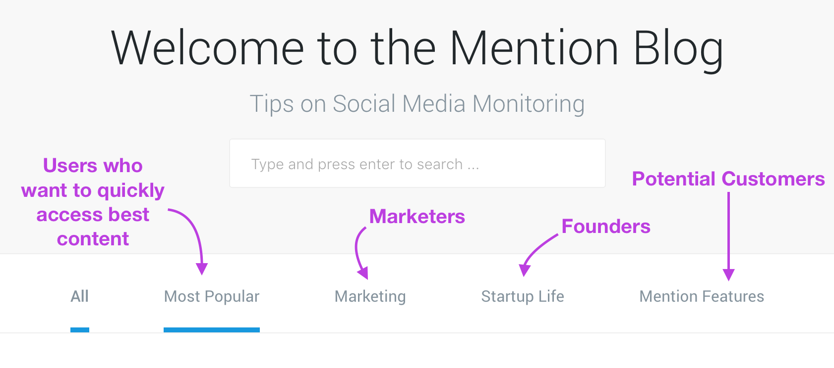
When you land on the blog, it’s obvious who the blog is for based on the categories—marketers and startup founders. By showing the bar, users can quickly navigate to the content they care about and skip the stuff they don’t.
To drive more leads, the team have also put in a subtle link to show off their latest features.
I got in contact with Brittany (head of content at Mention) to ask her why they decided to split the categories the way they did.
It seems the main motivation was based on the company’s customer personas. According to Brittany, “all of our content is focused on our main customer personas, which include marketers and startup execs. They also happen to be two of the largest sections of our blog, so those two categories are the most ‘browsable’”.
Brittany also commented on the Mention Features category. “The Mention Features category leads potential and current customers to a place where they can find new product announcements, tutorials to become a power user, and help resources in one spot. So it serves as both an acquisition tool and customer support”.
Don’t think that your archive page has to be boring. For inspiration take a look at Groove’s timeline view on the Journey to $500k a Month blog.
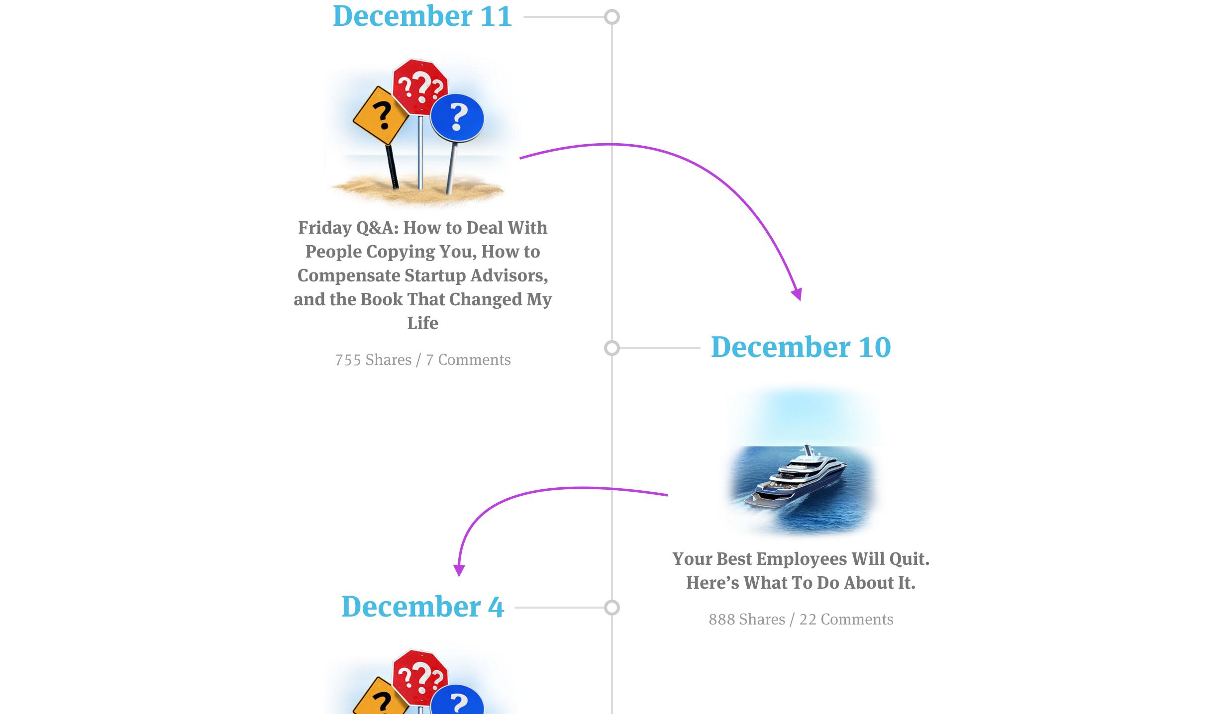
The timeline makes it super quick to navigate and access the articles you’re interested in. To combat scrolling forever like a maniac, they’ve added links to their best content and guest posts for easier reading.
Despite this, I think a search bar would be a great addition because of the vast amount of great content they’ve produced over the years.
Takeaway: Take the time to think about how users will navigate to and from your content. Make it easier for them to find the next article they may be interested in.
4. Use original photography
If you’ve got the space to do it—get snapping some pictures.
Although many startups now work remotely, you really don’t need an office to create inspiring photography for your company. While office shots of people working are great, try going outside with your team and either head for a café or take a group shot outside.
InVision’s Inside Design blog series takes advantage of some large office spaces to create a captivating inside look at some well known companies.
By using original photography the team paints a picture of the company and its culture. If stock imagery were to be used for these posts, they would be far less interesting to readers.
FocusLab are a design agency based in Savannah, Georgia. They have put so much faith in custom photography that they have a resident photographer who takes pictures that capture the imaginations of readers and clients.
Takeaway: Try using your surroundings to boost the look and feel of your blog. Custom photography is far more likely to bring in readers than generic shots that everyone uses.
5. Use whitespace
Whitespace is your readers’ best friend. It helps them break your articles into small chunks they can digest easily.
Don’t be afraid to increase that line height, the number of paragraphs or the padding around images.
On the Contentacle blog, we add 0.6em padding around all of our images and 1.7em for the line height. We know this is a lot of whitespace, but we want everyone to be able to read our content easily.
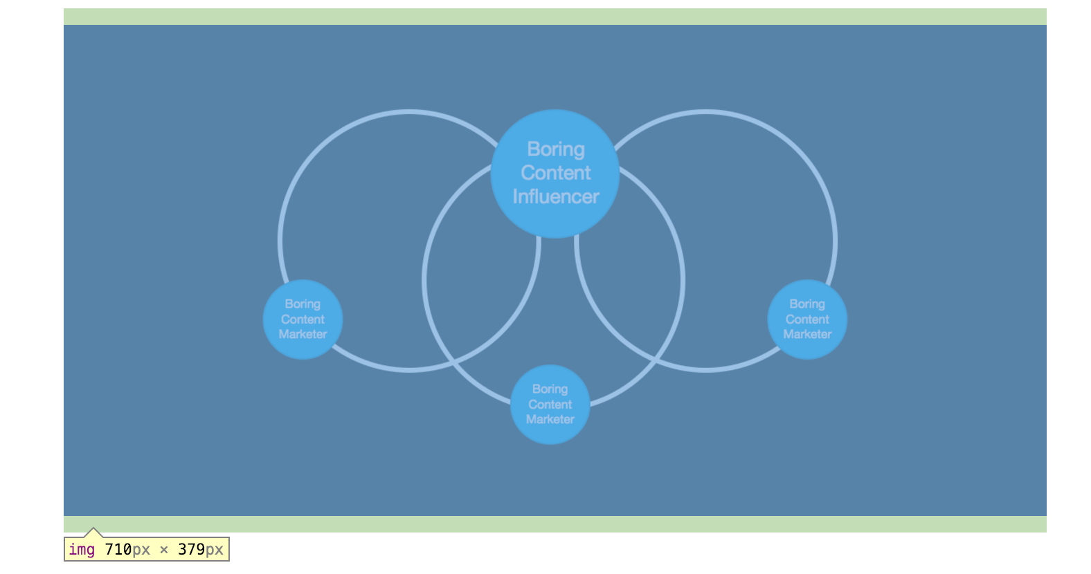
Padding around the images also has the added benefit of making the images stand out more. It allows the reader to focus on one bit at a time.
The Dribbble blog uses whitespace perfectly. Their font size is a little smaller though, so demands less whitespace to achieve the same effect.
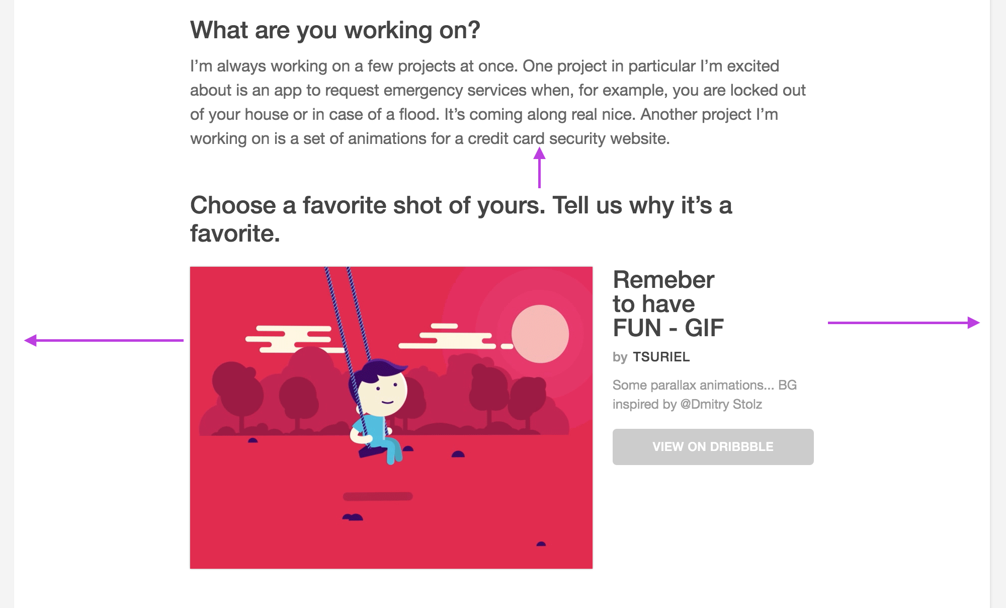
As you can see above, the articles are split into digestible chunks with whitespace in between for an easy read.
Takeaway: Don’t be afraid to increase the amount of whitespace to make it easier for readers to…well…read your content.
6. Use a sensible font size
While whitespace will help people read a little bit, font size will make the most difference for you and your readers. The amount of times I’ve had to fire up Readability because of the font size is ridiculous.
12pt is not a good size for the web. Sure, it looks great on paper, but that’s different. In fact 16pt looks around the same as 12pt on paper. D Bnonn Tennant—a freelance copywriter—demonstrates this well.

According to Tennant 16pt is the perfect font size for the web. It’s easy to read and as devices get larger, font size needs to catch up. It also helps people with visual difficulties to enjoy your content.
Almost 1 in 10 of your readers also has trouble with their eyes. Of the rest who don’t, most will still have to strain to read text smaller than 16 pixels, even if they don’t notice that they’re doing it.
D Bnonn Tennant, Smashing Magazine
Takeaway: Instead of going with the default 12pt try going with 16pt. While it may look a little large on your blog, visitors won’t need to strain to read your text.
Recap
Use bright colorful images. Captivate the imagination by creating custom illustrations.
Create a useful sidebar. Use the power of a sidebar to funnel your readers to the best content or a page of your choosing.
No map needed. Make your blog articles easy to access and find. If you’ve got a large archive, it’s extra important to keep past posts alive.
Strike a pose. Get that dusty unloved DSLR out of the cupboard and put it to good use. Take pictures outside with your team to create captivating images for your content.
Room to read. Whitespace and a larger font size make it easier for your readers to digest the content you write. Don’t be afraid to increase the font size or whitespace—it’s better to increase than to decrease.
Got your own tips? I’d love to read them in the comments below!
