How We Made the Product 100x Better in February
March 3, 2016
Product
Wow, can you believe it’s March already?
Nor can I. We seem to be having all the seasons at once in Toronto right now—it’s been +10C and -18C just this week, and there’s a pile of snow as tall as Jarratt’s hair outside.
Anyway, whilst trying to keep warm (and cool) inside this month we’ve been working on some super awesome features, and improving pretty much everything.
Design, Design Everywhere
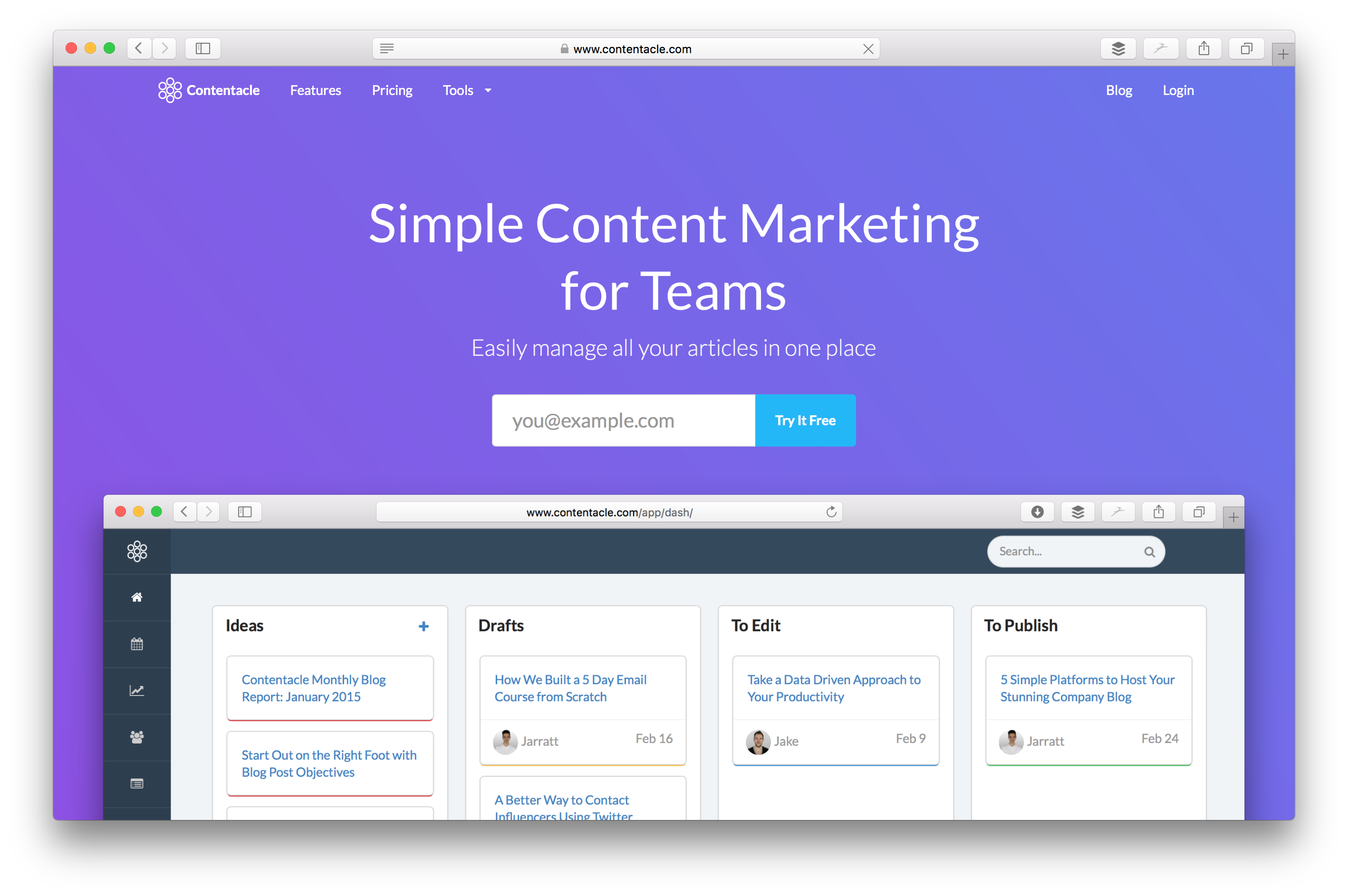
You eagle-eyed readers will have noticed this already, but we’ve completely redesigned the blog and homepage (ooh, just take a look at that moving gradient). It’s still very us, but now it better reflects our brand.

We’ve also totally redesigned our web app. Why? To fit in all the super-awesome new features of course! Here’s a sneak peak:
Can’t Find It? Search It.
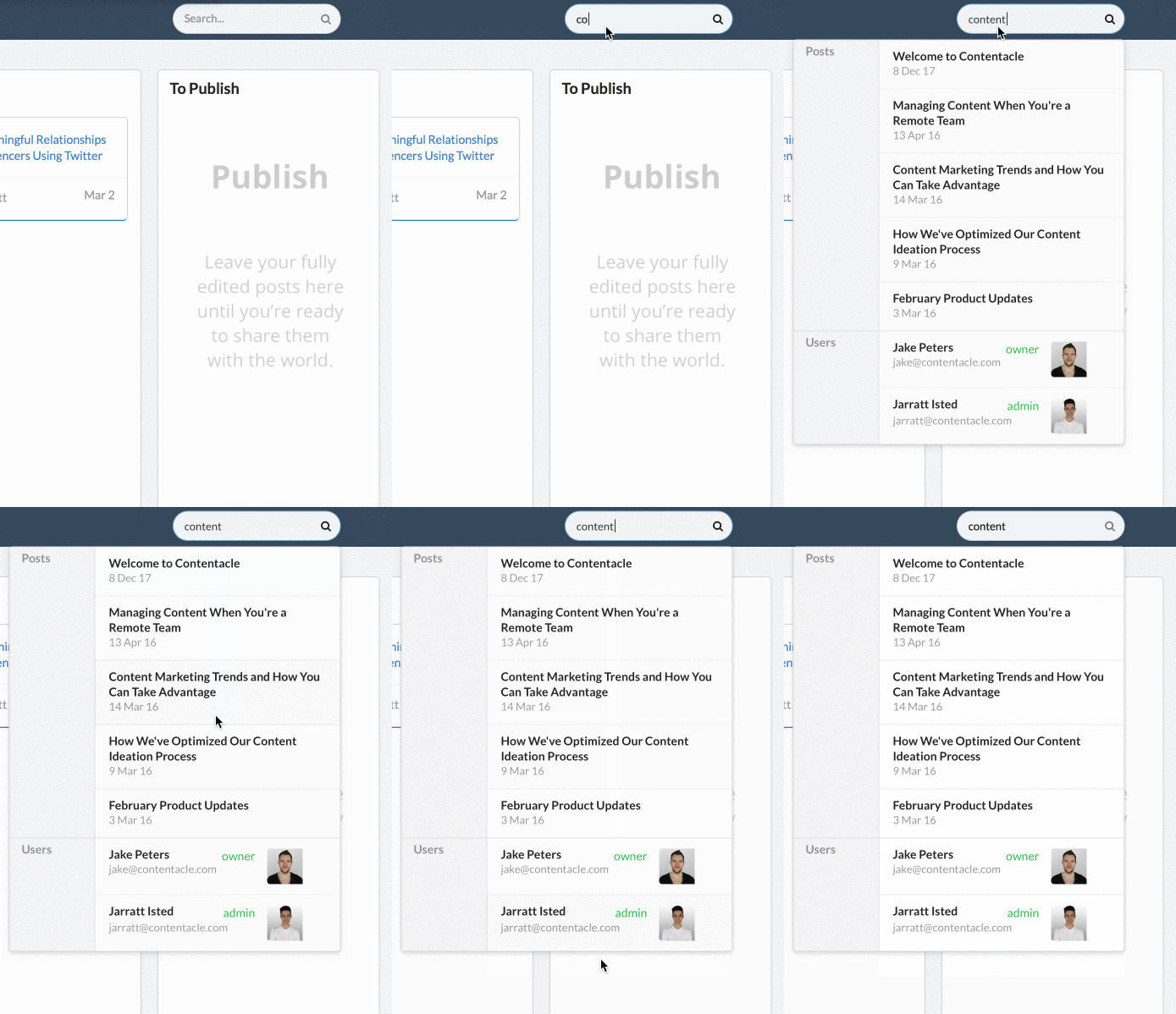
We’ve been helping teams manage their content marketing for a while now, but it’s always felt like there’s something missing. Turns out that something was realtime search.
So we added it.
Right now you can search for posts (by title, meta and body text) and authors (by name and email), and we’re doing our damnedest to find you the results you’re looking for.

But I Don’t Know How To…
Yeah, we used to get that a lot.
Luckily, you need yearn no longer. We’ve added a new ContentacleTips section to the (new) sidebar in the app. Click it, and you’ll get a list of videos—one for each page.
Something we haven’t video-fied yet? Check out our knowledge base.
Not answered there either? Man, you’re a tough crowd! That’s why we just switched back on our Intercom after a short hiatus. Just click the huge purple question mark to get in touch from any page.
All Your Integrations, No Limits
We used to only let you connect one integration per type. That was kinda sucky for social blogging platforms like Medium. So we’ve totally re-engineered it so you can add as many of each type of integration as you like. Go crazy!

## A Post Flow That Flows Better
At the start of the month we introduced some cool new modals for post previewing, publishing and tools. At the end of the month we ripped them out.
Reason? We started using modals to make your life easier, but actually it meant more clicks to get where you needed to go. We hated that we were making you click more. Plus we now have a lot more room to play with, and we can fit in even more great features in the future without cluttering the place up.
So now we have three separate pages. One for previewing a post, seeing it’s meta, and any comments. Another for actually writing your post. And a brand new Publishing screen that lets you send your post to multiple integrations at once and configure their options with ease.
A Nicer Editor, with Even More Markdown
Y’know that new editing screen? We couldn’t just leave it there. We gave it a fresh set of fonts, making writing and previewing about 100x nicer.
We’ve even started extending the Markdown syntax by adding inline comments. We took a look at the standards out there already (which nobody seems to agree on) and settled on using ++comment++. It’s pretty awesome for editorial notes, and we’ll parse it out in the preview and when you publish.

So what does that mean for you?
If you need to leave a note for yourself, or for an editor, you can just surround it with pluses, and we’ll never publish what’s inside it. So never again will you accidentally leave in any editorial comments and publish them live.
We’re thinking of new ways to enhance the Markdown too, so watch this space.
Less Noteworthy, But Still Awesome
Phew, that’s the bigger stuff we released last month. I’m tired just writing about it! If you’re still reading (I’m impressed! 🤗) here’s some other stuff we’ve been working on that’ll make your experience better.
Product
- SEO keywords pulled out of post
- Add your own SEO keywords
- Better drag/drop on Kanban, graphics fixes
- Nicer date picker for posts
- Improvements to word frequency
- Activity feed
- More robust integrations
- Placeholders on Kanban and post flow
Marketing
- Switched to Intercom for onboarding
- Intercom customer map on about page
- Content marketing course
As always, I’d love to hear from you. I’m already constantly on Twitter, so @mention me there with any feedback! Or if you just wanna chat of course, I’m down with that too.