
Stop Ignoring Your Visual Learners: Excite Them with Infographics
February 18, 2016
Writing
When it comes to reading content, one thing I love to see is an appealing graphic. I’ll happily admit I’m a visual learner, and sometimes you’ll find me scrolling through pretty images on Dribbble or Behance.
One way to make your visual learners’ day is to create an information graphic (infographic) for them. Infographics help you show off statistics and information—all without boring your audience. It’s time to stop ignoring your visual learners.
You can condense boring information and make it exciting again by adding images and illustrations. Make your content attractive for your visual readers. Not only does this help them learn, it also strengthens your brand, and it makes it easy for your readers to share.
What was once boring is now exciting. How awesome is that?!
Ok, so you may not be convinced it’s a good idea to spend time on Infographics, yet. So I’m gunna throw some quick stats at you:
- 65% of the population are visual learners (yikes, more than half!)
- 90% of the information that comes to the brain is visual
- Content with relevant images gets 94% more views than content without relevant images.
- When the images are relevant, readers spend more time looking at the images than they do reading text on the page
Pretty interesting stuff, huh?
Data Visualization Helps Us See Patterns and Connections
Above is a TED talk by David McCandless, a London-based author, writer, and designer. You should totally watch it.
In his talk, David explains that data visualization can help us understand patterns in data. We can connect the dots far easier than if it were written down. By comparing datasets side-by-side and using shapes, we better understand the data.
So, visualizing information, so that we can see the patterns and connections that matter and then designing that information so it makes more sense, or it tells a story, or allows us to focus only on the information that’s important. Failing that, visualized information can just look really cool.
David McCandless, TED
While the majority of Infographics are far less complicated and offer less data than those in the TED talk, creating them still helps readers sort out, process, and understand information.
The best Infographics show scale, offer connections and give the reader something to chew on. If you’re not getting your visual learners interested, they’ll leave and won’t share—so make it good.
Planning Our Your Infographic
You can’t go head first into these things. Don’t go hoping that your imagination will save you from creating a dreadful mess of shapes and words. You have to plan your Infographic in advance.
What’s the goal?
If you’re creating an Infographic, you’ll need to know what the end goal is.
It’s utterly pointless creating one if you don’t know what you want from it, or what you want your readers to do.
The majority of brands are creating Infographics with one main reason in mind—to [promote] their brand to a new audience(http://thenextweb.com/creativity/2014/04/25/3-ways-can-use-infographics-promote-brand/). Because these graphics are so shareable, readers are much more likely to pin them to their boards, tweet them out or email them to their co-workers.
Most brand infographics will use corporate or campaign branding to help viewers identify them as part of a particular brand. At a minimum, brand infographics should carry a corporate logo.
Justin Beegel, For Dummies
How Others Use the Power of Infographics
It wouldn’t be useful if I didn’t provide some real-world examples, now, would it? Let’s take a look through a handful of Infographics and analyze the purpose of each.
Making Research Digestible
Let’s face it, the majority of your readers aren’t going to look through an academic paper. They’re unlikely to pick out all the facts, quickly digest them, and learn from them.
That’s where Infographics come in handy. They make it easy for the reader to understand the data.
Buffer & SumAll teamed up a couple of times in the past to create awesome, beautiful, research-driven graphics. Below is one they created about how often to post to social media.

Goal: The purpose of this Infographic is to help the reader understand how many posts to share on social media per day. By using the size of car as a comparison, the reader can scan for the information.
In this case, it’s obvious Pinterest needs the most attention (so get pinning, people!).
Share the latest news about your product
Imagery helps a lot when it comes to sharing the news about your latest product or feature. People would much rather look at a shiny product image than a wall of text.
Quuu know this, and they used this technique when they launched their promoted content service.
Instead of using just plain text, they created a handy infographic for readers. It explains the basics of their new feature, how it works, and why it’s beneficial for your business. It’s super easy to understand!
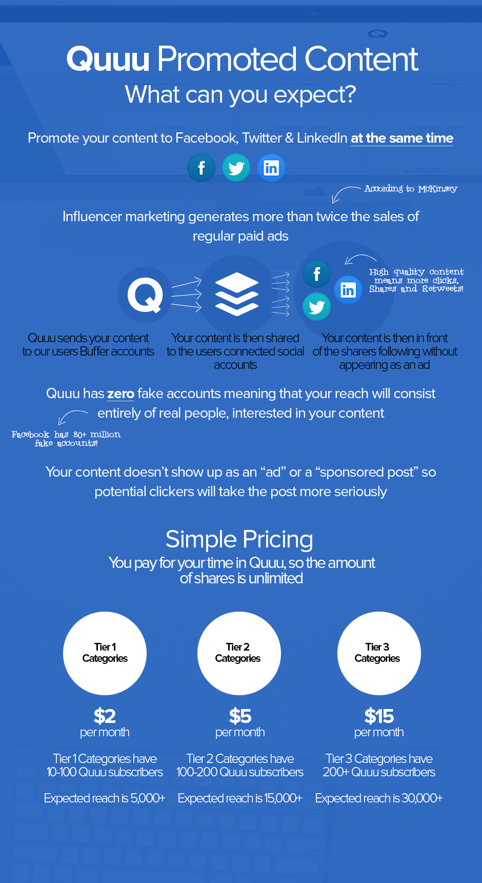
Goal: The team wanted to share their latest feature. Instead of using plain text, they made the information more appealing. By creating a graphic, the information was much easier to digest.
Share Company History & Milestones
If you’re a massive company like VISA, sometimes it can make a lot of sense to share your history with readers. How were you founded, what have you been up to, and what new technology have you worked on?
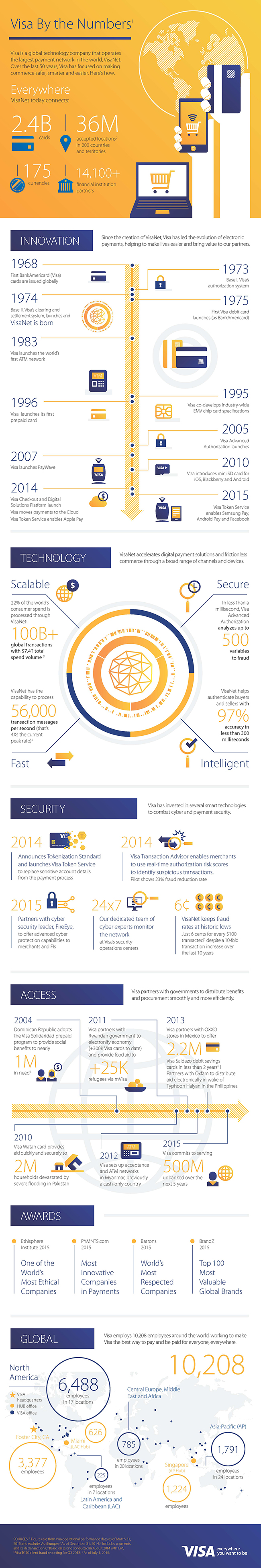
By creating this Infographic, readers can quickly understand how the company came to be, and what challenges they’ve faced along the way.
Goal: If you’re a large company, you can reach new customers by showing them your company’s history. You’ll gain new respect and connect with existing customers.
Spread Industry Information
One way to get your brand out into your industry without seeming too promotional is to provide industry facts and figures.
In this example, PetInsuranceU provided loads of interesting facts about pet insurance cover, without being over-promotional. Who knew that more claims were made on pets than people?!

Wow, that was a long infographic. But I bet you didn’t know about the company before. Well, now you do.
Goal: To spread the word about your brand while including interesting statistics about your industry. Try to make it less dull and promotional.
Tools to Create Your Infographic
Wait a minute. I haven’t explained how to actually create an Infographic yet.
Ok, so there’s a bunch of tools you can use, and depending on your design skill level you should pick the one that’s right for you. Here’s a list of my favorite ways to create a stunning graphic.
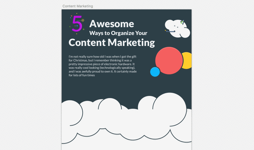
PiktoChart
PiktoChart is a platform that can help you create stunning graphics from data. It’s super easy to use, and one I’d recommend if you’re just getting started.
You can get started with a free template, choose from their premium collection, or start with a blank slate.
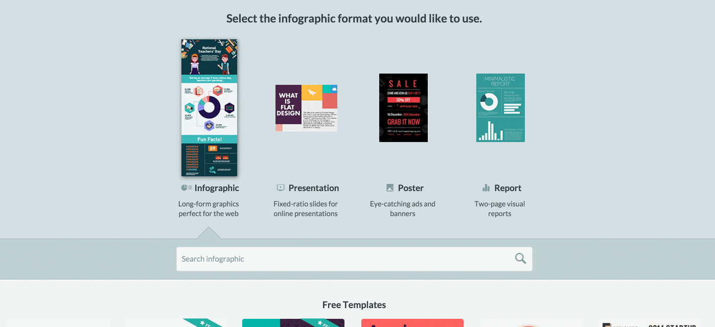
As you can see, it’s super easy to get started and you can quickly edit text and add images to your infographic. To remove branding at the bottom of your graphic, you’ll need to purchase the premium plan.
Great if: You want an easy to use, drag and drop interface with loads of illustrations made for you.
Canva
Canva is a popular option (7.9M people use it) for bloggers who don’t have the time to create their own illustrations. The platform has one of the biggest libraries of illustrations and images and it’s a great tool for Infographics.
Their onboarding is fantastic, and it’ll show you how to use each part of their platform.
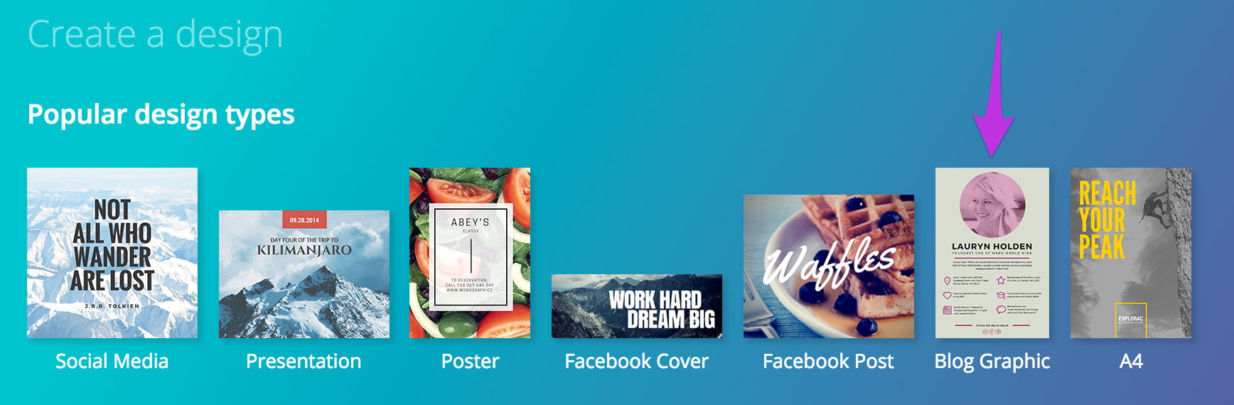
I went for ‘Blog Graphic’ as it was the right kind of size for an infographic. It was quite tricky to find the right size because the gradient in the background was quite distracting.
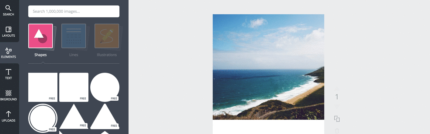
As you can see, it’s super simple to drag and drop elements onto the canvas. It resizes for you and you really don’t have to do much legwork.
One thing you may have noticed is the ‘FREE’ labels. Well, that’s because the higher-quality images, shapes, and illustrations are all paid. You pay per illustration, rather than choosing a plan.
Be careful, because you could easily rack up a bill for your infographic.
Great if: You want a simple platform to create all your social media images, infographics, and posters.
Do It Yourself
If you’re a designer, you can easily create an infographic yourself. While it may take longer to create, it’ll look exactly the way you want and you don’t have to pay anyone!
While I use Sketch, you could use Photoshop, Illustrator or Indesign. The great thing about creating your own is that you have complete flexibility when it comes to your graphics.
Great if: Someone on your team has design skills, and the time to create an infographic from scratch.
Next steps
Make sure your infographic has a goal. Without a goal, there’s not much point in creating your brand an Infographic. Do you want to reach more people, generate more leads or both?
Decide what type of infographic you want to create. Do you want to create it based on research, your latest feature or your company’s history?
Find the right software for you. Creating a custom graphic isn’t for everyone. Choose the right tool—one that happily fits into your workflow.
Have any tips on how to create the perfect Infographic for your website? Let us know in the comments!